1. For which lollipop brand did Salvador Dali design this bright yellow daisy pattern?
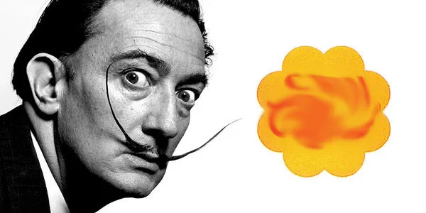
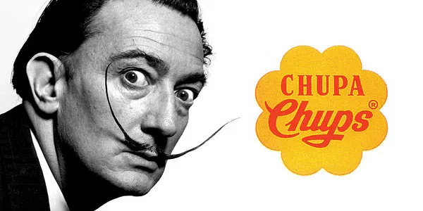
In 1969 (ok, technically not '70s, but let's just call it that), Chupa Chups asked Dalí to redesign their logo. The artist came up with the bright yellow daisy motif that's still used today.
Can You Name the Brand from it's Mascot?
While few of us become the face of a global brand, almost everyone recognizes some of the world's most iconic mascots. But how well do you really know them?Here's the challenge: can you name the brand after just a quick look at its character? Don't worry—you'll have unlimited time and multiple choices to help you out.
Before social media, ads were "life companions": McDonald's ads interrupted your Saturday Scooby-Doo; Coca-Cola's script appeared on your classmate's lunch can; Heineken's cursive caught your eye at the grocery store. These logos stored your life's little moments.
1. Why 70s–90s Logos Hold Your Youth Code?
For you (45+), these logos are "memory anchors." Back then, ads were fewer but deeper: TV had 3–4 channels (ads repeated); magazines were family staples (ads got re-read); billboards stayed for months (you saw them daily).
A 1965 baby might beg for Kellogg's Frosted Flakes in 1975 (for Tony the Tiger); save for Levi's 501s in 1985 (to show the red tab); pick a Toyota Camry in 1995 (for its reliable oval logo). These logos tie to your feelings, people, and actions. Seeing a 1970s Nike swoosh doesn't just mean "shoes", it means your first track meet shoes from mom.
2. Logo Styles: 3 Decades, 3 Vibes
1970s: Hand-drawn, earthy tones (brown, beige)
No digital design, logos felt casual. Levi's red tab was stitched (not printed); Heineken's cursive looked handwritten; Nike's first swoosh sat in a soft red circle. They felt like "neighborly" symbols.
1980s: Neon (hot pink, neon green), cartoon mascots
Prosperity brought boldness. Ronald McDonald wore brighter yellow; Tony the Tiger jumped in ads; Toyota's 1989 ovals had rounded edges. These logos matched your energetic teen/young adult years.
1990s: Minimalist, single colors
Globalization brought simplicity. Pepsi's 1993 "globe" logo used blue/red/white; IBM's blue rectangle had plain black letters; Coca-Cola stuck to classic red/white. They fit your mature, family-focused 30s.
3. This Quiz Is More Than "Logo Guessing"
We designed it to spark nostalgia:
All images are real vintage ads (not replicas) from brand archives and old magazines.
Explanations share stories: Nike's swoosh cost $35 (by student Carolyn Davidson); McDonald's arches symbolize "mother's arms."
Distractors are same-era brands (e.g., Adidas for Nike) to trigger more memories, not trick you.
4. Tips to Wake Your Memories
Think "scene" first: A red "K" = breakfast cereal (Kellogg's), not just "a brand."
Notice colors/textures: 70s logos are matte; 80s are shiny; 90s are smooth.
Don't fear mistakes: Wrong answers may remind you of beach trips in a Toyota, or typing on an IBM PC at your first job.
Conclusion: A Date with Your Past
This quiz isn't a test, it's a reunion with your younger self. Each question is a letter from the past; each logo is a "long time no see." Answer, and you might call an old friend, dig out vintage photos, or chat with your partner about 90s Pepsi vs. Coke.
Ready to step back? Let's meet your younger self in these logos.